
Tell the story cleanly
Hierarchy and type lead with the cause instead of a cluttered home page.
A charity redesign for RNCN with clearer storytelling, stronger hierarchy and routes into donation and outreach.
Website / Charity / Typography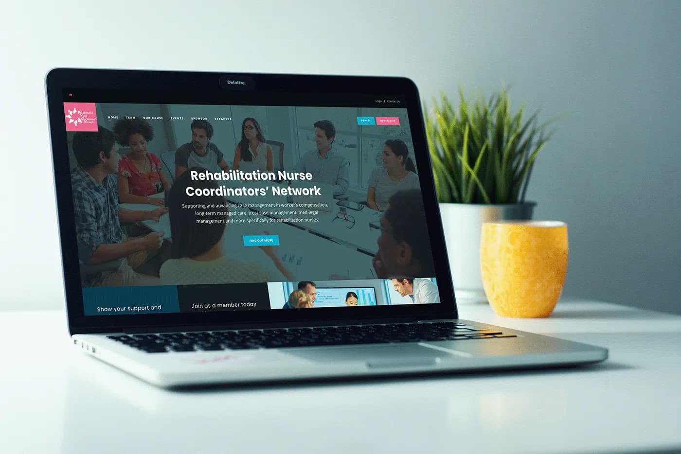
Charity sites need compassion and practicality at once: the cause, then the action someone can take today.
Typography, layout and page flow were rebuilt so the organisation can introduce itself quickly and direct people toward donation and outreach without noise.
Typography, layout and UX redesign for a charity presence that needs to explain the cause quickly and point people toward useful action.
Hierarchy and type lead with the cause instead of a cluttered home page.
Key sections are easier to scan so supporters can find what they came for.
Donation and outreach paths are treated as primary tasks, not footer leftovers.
Cause first, then a clear route to action.
Need a charity site that balances story with action?
The spreadsheet that’s holding everything together. The tool everyone works around. Let’s start there — with the person who would develop the software.
Talk about your projectYou talk to the person developing your software.